Beautiful . . .


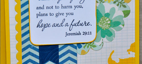
I had no idea this card would take me soooo long to create. I started with one color direction and totally ended up in another way. My starting point was the Viva la Verve sketch. I truly planned to follow it but I absolutely couldn't get it to work. I think my finished card is a little more CAS.


I always have problems with the 3 little dots that are often on sketches. I'm not much of a button girl though I own plenty that I like to look at! . . . but I knew I needed something for balance. I decided to use a small sentiment. 


Can you see the many different ways my brain was going? I wasn't happy with my sentiment choices as the scale was all wrong. The Beautiful Plain Jane was a perfect fit. I recently used this sentiment here for a different look. I originally thought I was going to use Berry Sorbet as the color base and Aqua Mist ink but that morphed!


I'm glad I kept working because I think the finished card works! Have a great day. ~Rhonda


Beautiful card
sketch: Viva La Verve April Week 4
stamps: Verve - Beautiful plain Jane, Thoughtful Florals; PTI - Fillable Frames #4
paper: Basic Grey - pb & j; PTI - Aqua Mist stripe pattern paper, Stamper's Select White, Enchanted Evening
ink: PTI - Enchanted Evening
other: PTI - Fillable Frames #4 die, Aida Impression plate; MFT - Fishtail Flag Stax, Blueprints One

Jeremiah 29:11


It must be getting close to the end of the month since I am posting so many Viva la Verve cards!! Christyne created the sketch for week 3. I stuck pretty close to the original sketch.

I love the fonts used for this Bible verse. So pretty.


I thought the bottom right corner needed some weight to give balance and I needed this to be mailable. I finally decided to use an artistic splat from Watercolor Wonder. I think this set will be very handy for such moments.

I used the heart border die from PTI to create the small scallops.  


I couldn't resist taking a photo of my "worksheet." It saves so much time when I write down everything I used for a later blog post. Do you have a routine/checklist for this purpose? Thanks for stopping by! ~ Rhonda 

Jeremiah 29:11 card
sketch: Viva la Verve April Week 3
stamps: Verve Plain Jane Jeremiah 29:11; PTI - Watercolor Wonder
paper: Echo Park - For the Record; PTI - Stamper's Select White; MFT - Lemon Drop
ink: Memento Tuxedo Black; MFT - Lemon Drop
other: Spellbinders Classic Scalloped Circles, Classic Rectangles Small; MFT - Fishtail Flag Stax, Blueprint 1; PTI - Heart Border die, Sunshine Impression plate; corner rounder

Yay! It's your Birthday


Are you playing along with the Viva la Verve Sketch Challenge? Laurie Beth has a fun sketch. I needed a birthday card this week so I decided to pull lots of birthday sentiments to create a subway art panel.


I was pleasantly surprised by how well the thin sentiments embossed. The die cut "2" and "U" provided some needed balance.

Are you getting lots of mileage out of your impression plates? Worth every penny! ~Rhonda


Yay! It's your Birthday card
sketch: Viva la Verve April Week 2
stamps: Precious Remembrance - Mom & Dad; Verve - Making a Statement; PTI - Stylish Sentiments: Birthday, Half & Half, Framed Out #1, Just the Ticket, Birthday Bash Sentiments, Tiny Tags II
paper: PTI - Stamper's Select White, Limeade Ice pattern paper
ink: Versamark
other: PTI - Block Alphabet & Number dies, Simple Stripes impression plate; White embossing powder

Project Life - Week Ten and Eleven


 Both sides of week 10 and 11

I wasn't sure if I would make my self-imposed deadline of posting a Project Life layout every Wednesday this week. I struggled with these pages. I didn't take enough pictures of everyday life. Thank goodness for the High School Camping Trip.

Left side of week 10 and 11

I need to figure out some way to put the pictures I want to use each week in a folder so I can find them. Anyone have a tip they can share?

Right side of week 10 and 11

I think I am going to have to create a checklist so I can remember items that I would like to do consistently as I notice that I didn't put white frames around the larger photos. Sigh....   

Enjoy your Wednesday friends! ~Rhonda


Project Life - Week Nine


Week Nine!!It's all about orange this week. The OSU Cowboys were in town for some basketball. Bob and I had a great time at the game. It has been awhile since I attended some college sporting events.


The freezer is fixed. There wasn't a big problem except me not calling to schedule a repairman. I don't like to make those calls. I'm weird I know. We also picked up our family pictures that we took in January. Nice to have that complete.


Staying busy here. Hope you are enjoying life. ~Rhonda


Round and round


A text path! That is the goal. I had taken this photo of a wagon in my backyard. I was focusing on the wheel so that I could get the foreground fuzzy. As I was looking for a picture to play with I thought the wheel would be great practice and the first thought that popped into my head was "the Wheels on the Bus go round and round." You can thank me now that the tune is stuck in your head as well. Since this isn't a bus I decided to think of something else. I am pretty happy with the results.

Photo One - No edits


Photo Two - Added Text Path and a texture. The concrete is a little softer and lighter.

Photo Three - Added another texture with a yellow grungy look. I think #3 is my favorite. 


Which one do you like? It could even be #1. You wouldn't hurt my feelings. ~Rhonda

textures used:
Kim Klassen - PaperandPaste, Sybil


Eggs!


Yes, I know Easter has passed but I'm a lot behind on my homework for Kim Klassen's Beyond Beyond class. Every week is a new adventure that goes on for a whole year. I'm learning lots. I'm trying to wrap my brain around all the new information. I think it's gonna EXPLODE!

This first image is the original that we were given to practice on. We were to add a texture layer along with learning some mad brush skills and text.


I hope you can see some differences between the two images. It's all in the subtle changes don't ya know! Making the shadows between the eggs lighter and a little more dreamy and soft. I used the font Arsenale White for my Oh happy day!

I learn a little more each day! ~Rhonda

Zooming by


I'm on a birthday card run! Our family has lots of spring and summer birthdays so I'm getting ahead. 


I have been trying to use the "really busy" papers in  my paper pads. They can be a bit challenging for me to use. I think I may have hit on the formula that works for me. A sentiment on a tag or banner and a layered embellishment to give my eye a place to focus on. What's your secret?


Have a wonderful weekend! Rhonda


Zooming By card
sketch: Viva la Verve March Wk#3
stamps: PTI - Lil Hot Rod
paper: Basic Grey - Wander paper pad; PTI Stampers Select White
dies: MFT - Blueprint #1; PTI - Lil Hot Rod, Limitless Layers 1 3/4" circles, By the Numbers

happy Birthday


A quick and easy Birthday card today. The little flag dies are from MFT. It seemed like the perfect thing to pair with the fun happy font stamp. The 3rd flag is actually a hybrid of PTI's double ended banner die and MFT flag so it would have the hole at the top for the brad and be long enough for the sentiment. I can see using this layout again with more masculine colors. 


We planted tomatoes this weekend and now we are worried about a light freeze.  Come on spring!! Anyone else ready for warmer temps? Have a great week!


happy card
stamps: MFT - Birthday sentiments; PTI - Tweet Talk, Birthday Bash Sentiments
paper: Crate Paper - Story Teller; PTI - Kraft
ink: PTI - Enchanted Evening
other: My Mind's Eye - Lil Robots brads; MFT - Blueprints 1 dies; PTI - double ended banner

Project Life - Week Eight


Project Life - Week Eight. It started with President's Day. Bob was off so we were able to have lunch together and wander around a few stores. 

Both sides of Week Eight

I got a shout out from Papertrey Ink for a card I made for MIM. That is always exciting. 
Left side of Week Eight

Another organization job rounded out the week. Helping people move to their new homes is a blast. I am very blessed to have such a fun job.

Right side of Week Eight
 
As I have been working on several weeks at a time to get caught up I am finding that I need to be taking MORE pictures and writing better notes. Hope your week is going well. ~Rhonda


Think of You


Think of You is based on the first of 5 April sketches for Verve's Viva la Verve challenge. I actually completed all the March sketches and I am planning to do the same for April. Though I hope a little more timely.  I took a few liberties with Amber's sketch but am pleased with the result.


I loved being able to repeat the diagonal of the yellow stripe with the impression plate on my flag.  Blue and yellow just sing spring, don't ya think? ~Rhonda


Think of You card
sketch - Verve
stamps: PTI - Half & Half
paper: My Mind's Eye - Tangerine; PTI - Vintage Cream; various scraps from paper pads
ink: PTI - Smokey Shadow
other: Spellbinders - Classic Circles; PTI - Limitless layers ovals, Herringbone Impression Plate; MFT - Fishtail Flag Stax,  Leaf Filled Flourish


Epic Year


I'm playing along with Papertrey Ink's MIM #110 - Collage Elements. My process started out quite accidentally. I left my Enchanted Evening ink open all night so I stamped the pad on a piece of scrap paper to see if it still was good (it was) and thought the paisley shape was fun and could be perfect for the base of a collage. You can see it on the "Thanks" card further down in this post.


I pulled out Grunge Me and went crazy with the geometric shape. I added dots, circles, and splats to build my collage base. I think these are especially great cards for guys. I love the Ad Sense die for the sentiment on this card.


The red dots and the big splat are from Grunge Me. The paisley shape is courtesy of my ink pad.


These great circles and the splat are from a new stamp set I purchased from Precious Remembrance - Positive Thoughts.


I had a blast creating these. Makes me want to throw paint around. ~Rhonda

Epic Year card
stamps: PTI - Ad Sense, Grunge Me, Boy Basics: Game On; Precious Remembrance - Positive Thoughts
paper: PTI Spring Rain; lined paper - stash
ink: PTI - Pure Poppy, Enchanted Evening, Spring Rain
other: PTI - Ad Sense die

Thanks card
stamps: PTI - Grunge Me, Boy Basics: Game On, Birthday Bash Sentiments; Precious Remembrance - Positive Thoughts
paper: PTI Spring Rain; lined paper - stash
other: Enchanted Evening ink pad as stamp

HB 2 U card
stamps: PTI - Grunge Me, Boy Basics: Game On, Birthday Bash Sentiments; Precious Remembrance - Positive Thoughts
paper: PTI Spring Rain; lined paper - stash
ink: PTI - Pure Poppy, Enchanted Evening, Spring Rain

Project Life - Week Seven


Week Seven finds us in the week of LOVE. Valentine's Day. I was able to get my packages mailed. Can you believe how much it costs to mail a small box?


Do you visit bookstores and take pictures of the books you want to read? I found 3 that I would like. Do you have a book recommendation for me?
 

As an empty nester, cooking has fallen from the priority list (my poor hubby) so he was pleasantly surprised when I cooked this weekend. As you can see from the grocery store receipt the cost to feed 2 isn't much. Just don't figure in the cost of eating out a little more.


Have a great week! ~Rhonda

 
supplies used:
Becky Higgins Digital Project Life Template A, Clementine Core Kit
Jessica Sprague journal cards
Cathy Zieklse week in review
September Blue -  Word Art Titles
Persnickety Prints - Black and White paper
Elise Blaha - quotes with handwriting
Nancy Jantz - Charcoal circle
Carina Gardner - arrow
Splendid Fiins - journal cards
Powered by Blogger.

Keep In Touch

Subscribe via Email

Enter your email address:

About Me

My photo
Texas, United States
Life is full of interesting pieces. I am grateful that I can combine my love of stamping, organization, and DIY projects.

BeStill52

KIM KLASSEN dot COM

Followers

Grab My Button

Blog Archive

Mojo Monday Blinkie